Mobile first design.
Travel Planning Site


Project Overview
Project Type: Mobile-first site design Team: Independent project with feedback from mentor and peers
Tools: Figma, Optimal Sort, Miro, Zoom Role: UX/UI design, branding
Context:
Meet Sarah, a passionate backpacker and traveler who loves exploring remote trails and new cultures. Frustrated by the lack of a comprehensive travel planning tool, she often had to gather information from multiple sources—trail details, local guides, packing lists, and budgeting tools—and create her own planning guide.
Problem Identified:
Despite the rise in adventure travel, there's a gap in the market for an all-in-one platform tailored to backpackers. Current tools lack comprehensive planning, forcing travelers to spend hours gathering information and manually organizing their trips.
Research
Research Objectives
Assess the features, functionalities, strengths, and weaknesses of current travel planning platforms available in the market.
Investigate the specific requirements, preferences, and pain points of backpackers and adventure travelers regarding trip planning, including desired features and functionalities.
Gauge user satisfaction levels with current travel planning solutions, including factors influencing satisfaction and areas for improvement.
Competitive Analysis
What’s this?
Assessing competitors' products to evaluate their UX and UI design. It helps identify strengths, weaknesses, and opportunities for improvement, guiding your own design by learning from what competitors do well or poorly.

Key Takeaways
For Roamr, I reviewed popular travel planning and hiking products, analyzing various features and user reviews to understand their strengths and weaknesses, ultimately identifying potential opportunities in the market.
Analysis of AllTrails and The Hiker Project revealed a focus solely on trail-related features, lacking broader trip planning functionalities. Conversely, WonderLog and Pilot Travel Planning apps offer a mix of similar and distinct features beyond trails, such as budget tracking. This highlights a trade-off between specialized functionality and comprehensive trip planning capabilities in existing solutions.
Ultimately, by harmonizing trail integration, offline accessibility, and comprehensive itinerary planning, there is space for another travel planning site that can revolutionize how backpackers and adventure enthusiasts engage with the great outdoors, empowering them to embark on unforgettable journeys with confidence and ease.
In conducting user interviews for the travel planning app, I engaged in one-on-one discussions with potential users, using a scripted set of prepared questions. During these interviews, I encouraged open-ended responses, allowing participants to share their experiences, preferences, and pain points freely. By recording the interviews and taking detailed notes, I aimed to gather key insights and identify recurring themes to effectively inform the app's development process.
I completed five interviews with people ages 35-55: four were women, one was a man; one spoke from a family perspective, two were mostly solo travelers, and the other three traveled with a group of family or friends.
User Interviews
Key Takeaways
What’s this?
User interviews are crucial to a UX/UI project because they provide direct insights into the needs, behaviors, and pain points of real users. These interviews help to create solutions that are tailored to users' actual experiences, ensuring the product is intuitive, effective, and aligned with user expectations, ultimately leading to a better user experience and more successful outcomes.
In the digital age, trip planning predominantly occurs online, with platforms like Pinterest, blogs, social media, and AllTrails being popular choices. While many find AllTrails reliable, its focus solely on trails limits its utility for comprehensive trip planning. Participants expressed frustration with the time-consuming nature of gathering information from multiple sources, highlighting the need for a centralized platform.
Key themes emerged around the importance of reliable information and the challenge of discerning trustworthy sources. Participants suggested features such as connecting travelers in the same location and incorporating interactive elements like scavenger hunts to enhance the planning experience, especially for families with children.
A consensus was reached on the desired features for a comprehensive trip planning platform, including:
A curated list of considerations for trip planning
A dropdown menu for customizable itineraries
Information on trailheads, permits, meals, transportation, flights, and gear lists
Integration of day hiking trails and local attractions to enrich the travel experience.
Overall, participants emphasized the need for a user-friendly platform that consolidates trip planning resources, streamlining the process and enhancing the overall travel experience for users.
Personas
What’s this?
Personas are important because they provide a clear, human-centered understanding of target users, helping designers and developers create products that better meet user needs. Personas are developed through a combination of user interviews, research, and data analysis. By gathering insights from real users—such as their goals, challenges, behaviors, and preferences—designers can create fictional representations that reflect common user types.
How might we?
What’s this?
How Might We (HMW) statements are developed from insights gathered through user interviews, research, and observations. Key challenges or pain points from these findings, are then reframed into open-ended, solution-oriented questions starting with "How might we...".
How might we cater specifically to the unique needs of backpackers and hikers for travel planning by providing a platform that integrates trail information, gear recommendations, and camping permits with broader trip planning features such as transportation, meal planning, and budget tracking?

How might we consolidate all aspects of trip planning into a one-stop solution for backpackers and other travelers, encompassing everything from itinerary creation, trail details, and gear recommendations to real-time updates on weather, trail conditions, and transportation options?
How might we integrate pre- and post-hike planning to create a streamlined and user-centric process for travelers, allowing them to efficiently organize and prepare for their trips?
Design and Prototype
What’s this?
A site map is a visual representation of a website or app's structure, outlining how pages or sections are organized and linked together to guide users through the content.
Site Map
Planning a site map for Roamr involved outlining the app's navigational structure. It required consideration of key features such as itinerary creation, destination search, accommodation booking, and activity recommendations. By organizing these elements cohesively, the site map ensures an intuitive user experience, guiding travelers seamlessly through the app's functionalities from start to finish.
What’s this?
A task flow is a step-by-step visualization of how a user completes a specific task within a system or product. It breaks down each action a user takes, from start to finish, without focusing on decision points or alternative paths. Task flows are developed from user research and help designers understand how users naturally navigate through specific tasks, highlighting potential areas for optimization.
What’s this?
A user flow is a more detailed diagram that shows the complete journey a user takes to accomplish a goal, including the decision points and alternative paths. It maps out different possible routes based on user actions and choices. User flows are also based on insights from user research and are used to understand how users move through the product, helping designers identify bottlenecks or friction points in the overall experience.
User Flows
User flows for the Roamr travel site encompass various paths, including creating a login or account, and planning trips with pre-made itineraries, blank templates, or accessing saved itineraries. These flows are structured to guide users seamlessly through the process of account creation, itinerary selection, customization, and retrieval, ensuring a user-friendly experience that caters to diverse travel preferences and needs.
Task Flows
Planning a site map for Roamr involved outlining the app's navigational structure. It required consideration of key features such as itinerary creation, destination search, accommodation booking, and activity recommendations. By organizing these elements cohesively, the site map ensures an intuitive user experience, guiding travelers seamlessly through the app's functionalities from start to finish.
Mid- Fidelity Wireframes
What’s this?
More detailed than lo-fi, with clearer content and some interaction elements. Focuses on refining layout and functionality after initial feedback.
Using Figma, I translated key screens into mid-fidelity digital wireframes, enhancing the detail and structure of each interface element. This transition from hand-drawn sketches to a digital format provided clarity on the feasibility of my initial low-fidelity concepts and allowed for more precise exploration of layout and functionality.
During this phase, I shared my wireframes with peers and received valuable feedback on enhancing user-friendliness, especially regarding buttons and CTAs. I incorporated this feedback as I transitioned into the high-fidelity stage of design.
Low- Fidelity Wireframes


In the early phases of crafting the Roamr app, I rely on hand-drawn low-fidelity wireframes to establish the interface's framework. These sketches allow me to swiftly conceptualize essential features like login/account creation and trip planning, offering options for pre-made itineraries, blank templates, and saved itineraries. This approach facilitates efficient exploration of diverse user flows and layout options, laying the groundwork for detailed prototyping and refinement as development progresses.

What this?
Basic, rough sketches focusing on layout and structure without detail. Used early in the design process to explore ideas quickly.


Branding
In crafting a logo, I contemplated the essence of travel and backpacking, considering elements like maps, hiking boots, compasses, topo maps, and mountains. After careful consideration, I decided on the pin drop on a map as the most universal symbol, representing all forms of travel.
Style Guide and Components
The style guide serves as a blueprint for maintaining consistency and cohesion across all design elements. It includes components such as typography, color palette, iconography, and buttons. These components were carefully selected and documented to ensure a seamless and intuitive user experience, reinforcing the brand identity and facilitating efficient development and updates.
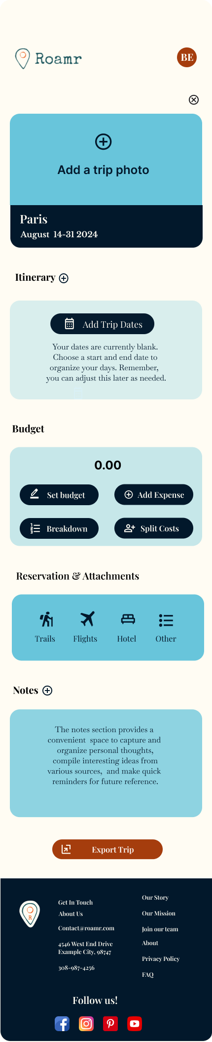
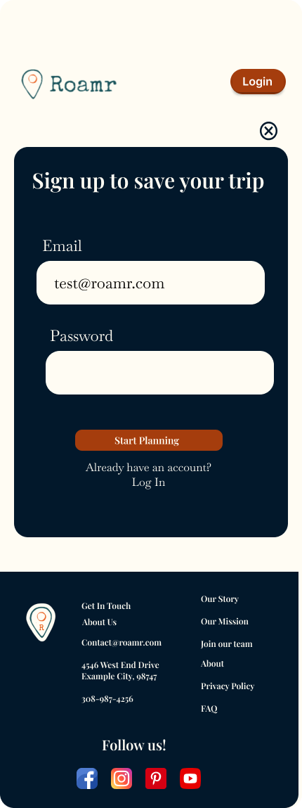
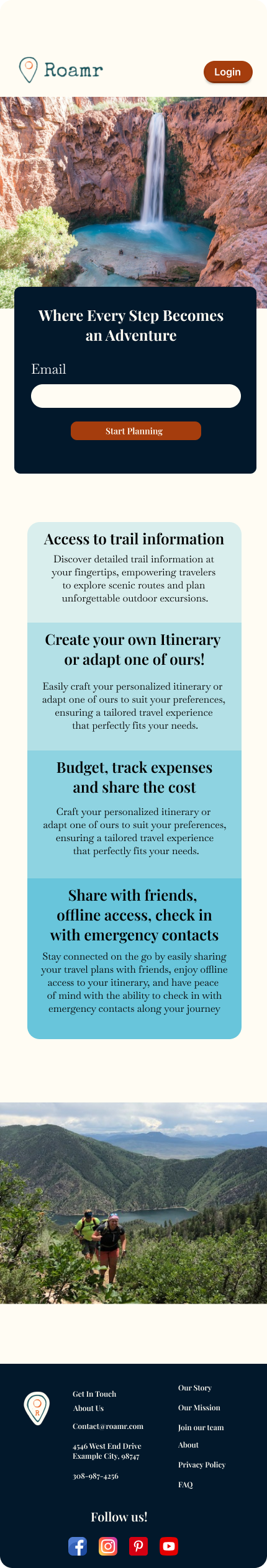
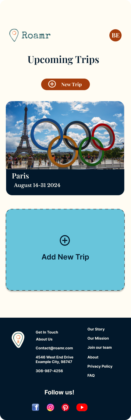
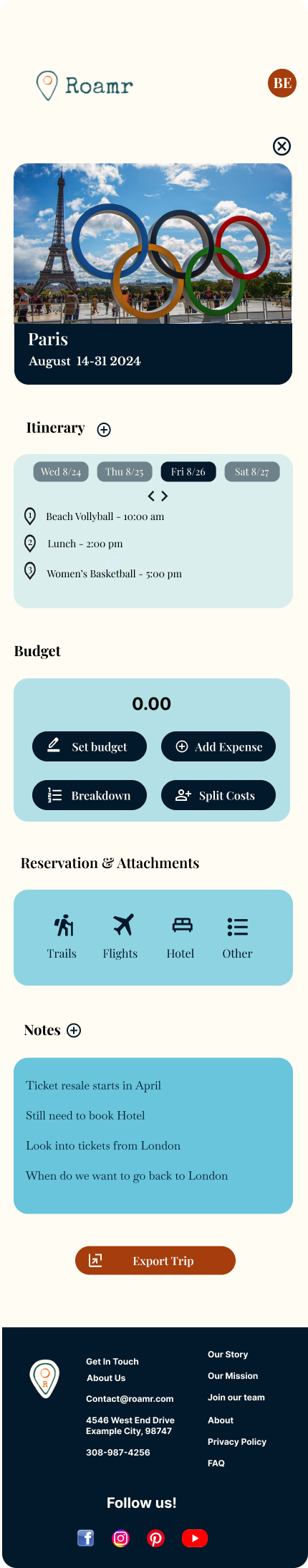
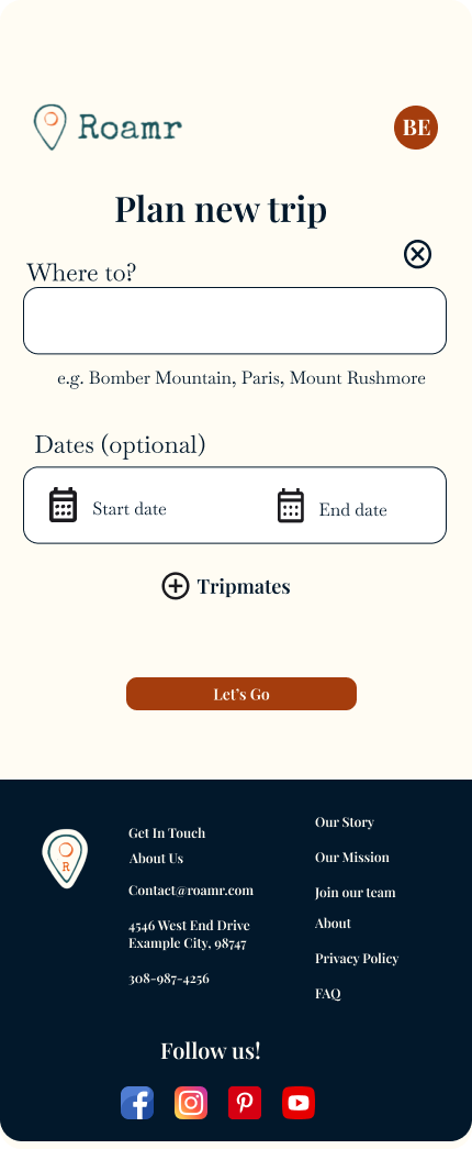
High-Fidelity WireFrames
What’s this?
High-fidelity wireframes are detailed, interactive mockups that closely resemble the final product. They showcase refined design elements like color, typography, and interactions, helping to test functionality and usability. Their purpose is to ensure the design aligns with user expectations before moving into development.
When designing high-fidelity wireframes, I refine the layout, visual elements, and interactions to closely resemble the final product. This involves incorporating specific design elements like colors, typography, and imagery, as well as adding interactive elements for a realistic user experience. High-fidelity wireframes help me communicate my vision effectively, gather feedback, and iteratively refine the design to meet user needs and business objectives.

User Testing
What’s this?
User testing is a process where real users interact with a product or prototype to identify usability issues and gather feedback. It helps understand how users experience the product, ensuring it meets their needs and expectations. Feedback from user testing is analyzed and used to refine the design, addressing pain points and improving the overall user experience to better align the product with user needs.
UI Interaction
For the Roamr app, I conducted moderated user testing via Zoom, utilizing Figma prototypes to evaluate the design and functionality. The sessions involved UX/UI designers, some with a special interest in travel and backpacking, which allowed for more targeted feedback on both design and relevance to the app's purpose. During the testing, participants were guided through key user flows and asked to complete specific tasks, providing real-time insights into the app's usability. This approach helped uncover potential improvements and ensured that the app meets the needs of both design-focused users and the travel-oriented audience. The combination of professional design expertise and travel-specific feedback resulted in a well-rounded evaluation, highlighting both functional improvements and aesthetic refinements.
Iterations
Iterations for the Roamr app included implementing changes based on feedback from usability testing. I refined the logo, ensured buttons were more uniform across the app, updated the budget card, and adjusted the sizing of one of the boxes for better visual balance. Additionally, I focused on improving spacing consistency throughout the app, creating a more polished and cohesive design. These changes helped enhance both the visual appeal and usability of the app.
Key Takeaways
What’s this?
Iteration is the process of repeatedly refining and improving a product, design, or solution based on feedback and testing. Each cycle of iteration involves making adjustments, testing the changes, and evaluating the results to move closer to an optimal outcome
Consistency in Design: Feedback revealed the need for uniformity in button styles and overall visual elements. This led to updates ensuring a more cohesive and polished look across the app.
Improved Layout: Adjustments were made to the budget card and box sizing based on user feedback to create a more balanced and user-friendly interface.
Enhanced Branding: Refining the logo and ensuring it fit seamlessly into the app design helped strengthen the brand’s visual identity.
Spacing and Readability: Usability testing highlighted the importance of consistent spacing, which was addressed to improve overall readability and flow within the app.